Nespresso redesign
My way of working
Let's check out my preferred way of working, to get the Nespresso.com website more in-line with the offline experience
The case
Most of us will know Nespresso from the television commercials with George Clooney, the posh flagship stores or the abstract coffee machines. But fewer people know the actual website. That's because the proposition and the tone of voice are a bit out of balance when it comes down to the previously described touchpoints. Time to do some redesign in my way of working; thorough research to get to know the needs of the end-user, create a business case, wireframing the user experience, designing the user interface (desktop/mobile), prototype and test it, pivot and iterate.
.
Know your end-user
Before I even start designing, I first conduct a thorough research of the market and it's niches, the needs of the end-user and existing bottlenecks. Go to a store, ask questions, observate. The data you collect will serve as input for design thinking sessions generating products and services with added value and a strong business case.
Header
The solution needs to be user centered, so thorough research is a must. After 3 days of intense field research, shadowing employees and interviewing them, we’ve mapped all internal proccesses and bottlenecks creating a holistic view on the matter.
Concept
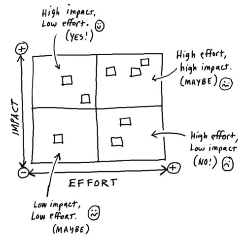
Ideally you would go into a Design Thinking workshop together with stakeholders, end-users, developers etc. Each and everyone has his own view on the problem statement which you have formulated during the research. Combining that knowledge with DT will eventually generate some great ideas. We will rank the ideas by plotting them on a effort/impact matrix.
Unique selling points
In order to gain traction within a company working together with the client is key. So we facilitated design thinking sessions in co-creation with IKEA generating awesome out of the box ideas. We picked out two of those ideas and converted them into a proof of concept wit a strong business case.
Wireframe
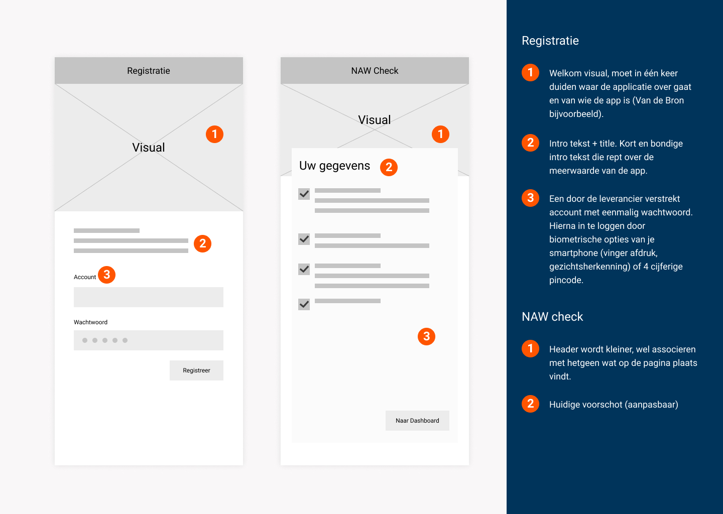
So, now the real user needs are clear and we came up with an awesome concept, it's time to wireframe the user experience. Not only will the document describe the interaction between user and application, it will go in depth about tone of voice, content and functionalities too. After approval of the client, the wireframe will act as input for both designers as developers.
Live demo
The solution needs to be user centered, so thorough research is a must. After 3 days of intense field research, shadowing employees and interviewing them, we’ve mapped all internal proccesses and bottlenecks creating a holistic view on the matter.
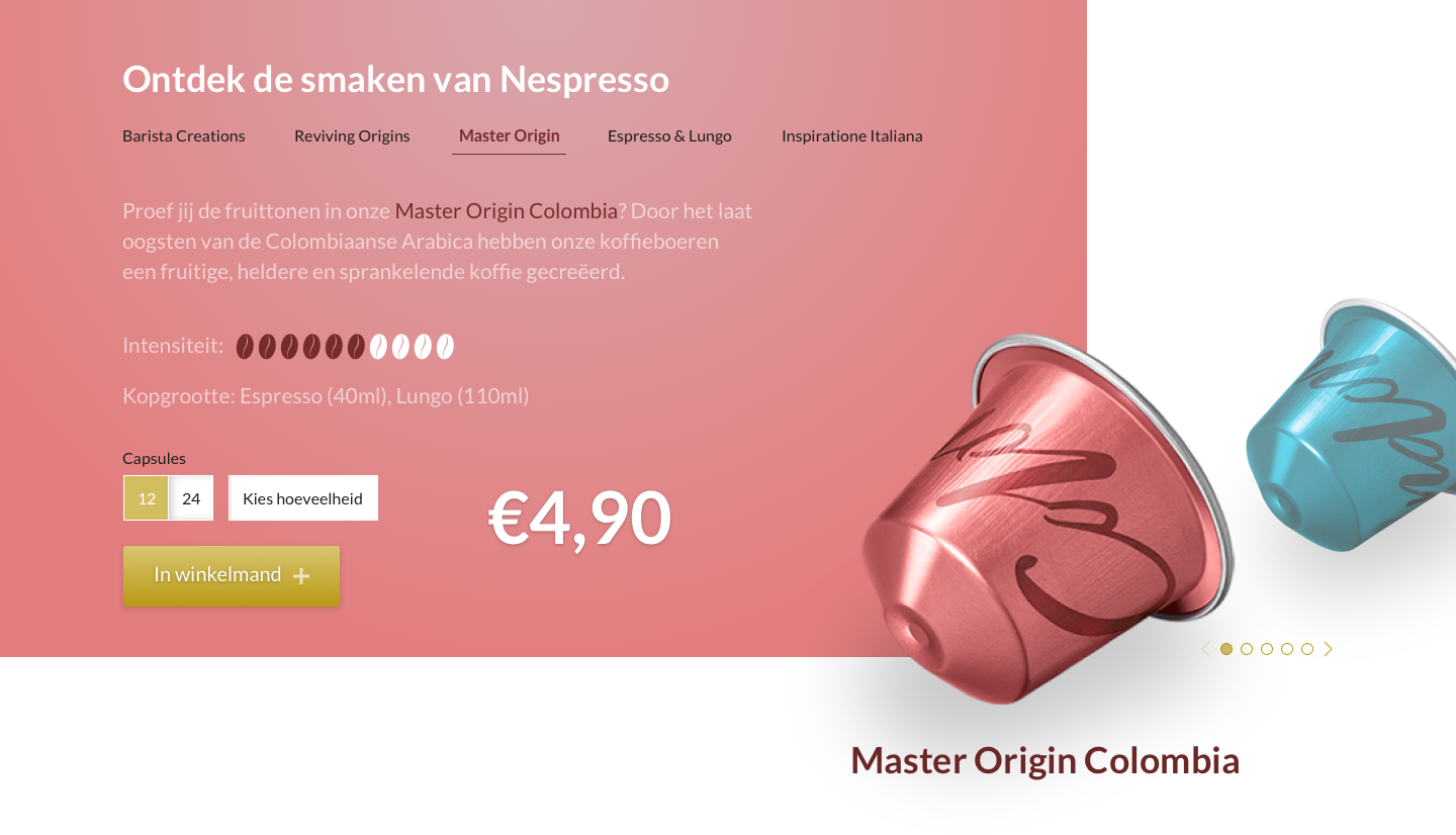
Making it look good!
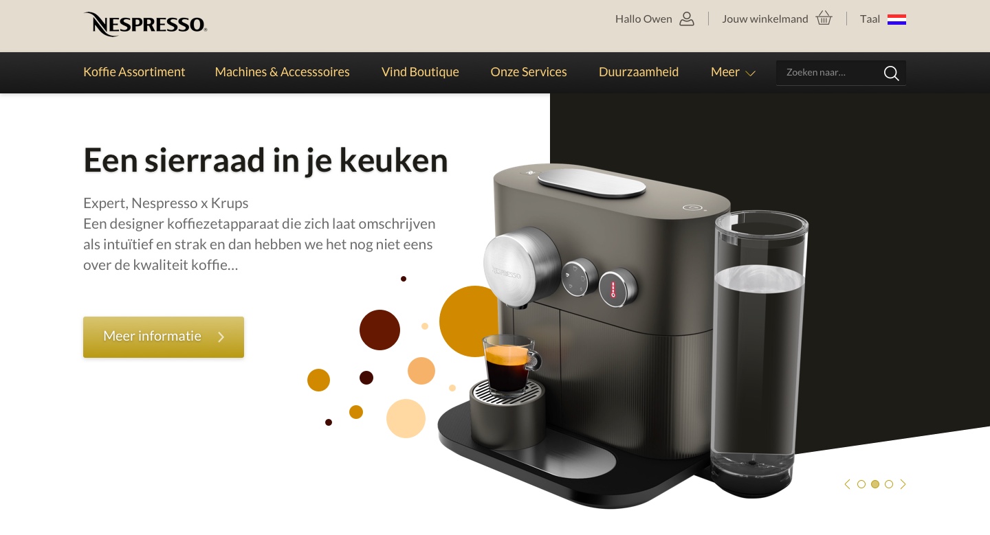
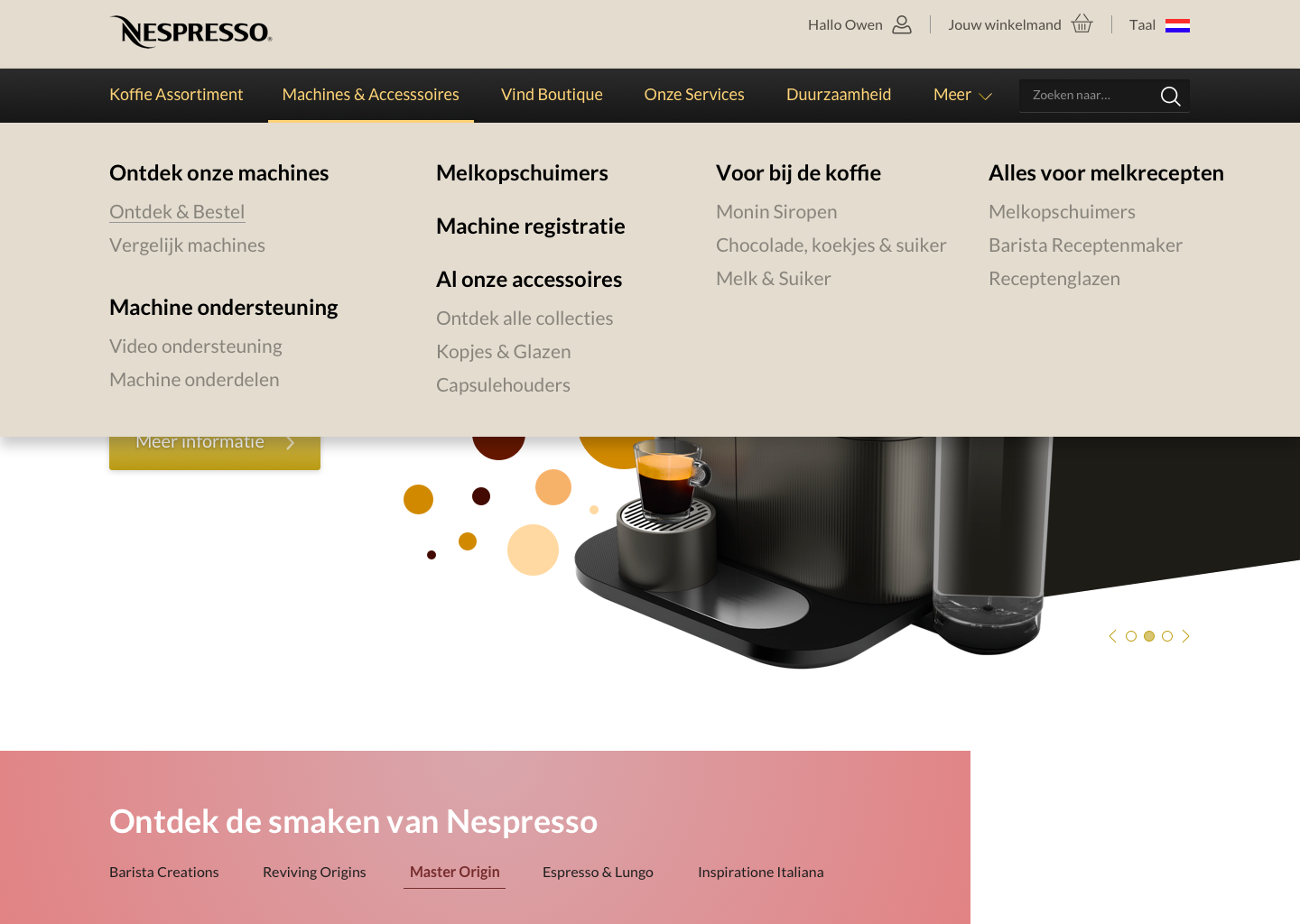
Yep, I'm a designer by trade so no worries about the aesthetic part ;-) Important is to have a good rationale behind your design choices to back them up. In this case I took the color pallete of the stores and integrated them into the website, put it all on a grid with enough whitespace to let the design 'breathe'. You can find the desktop demo on the bottom of this page!
Sign-up
In order to gain traction within a company working together with the client is key. So we facilitated design thinking sessions in co-creation with IKEA generating awesome out of the box ideas. We picked out two of those ideas and converted them into a proof of concept wit a strong business case.
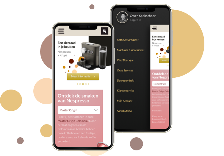
Mobile
Where would you be without a mobile version of your website. So, I made a responsive version, keeping in mind the readability of the text, content first priciple, placement of the buttons and responsive logo. Check the demo by clicking the image.
Other users
The solution needs to be user centered, so thorough research is a must. After 3 days of intense field research, shadowing employees and interviewing them, we’ve mapped all internal proccesses and bottlenecks creating a holistic view on the matter.
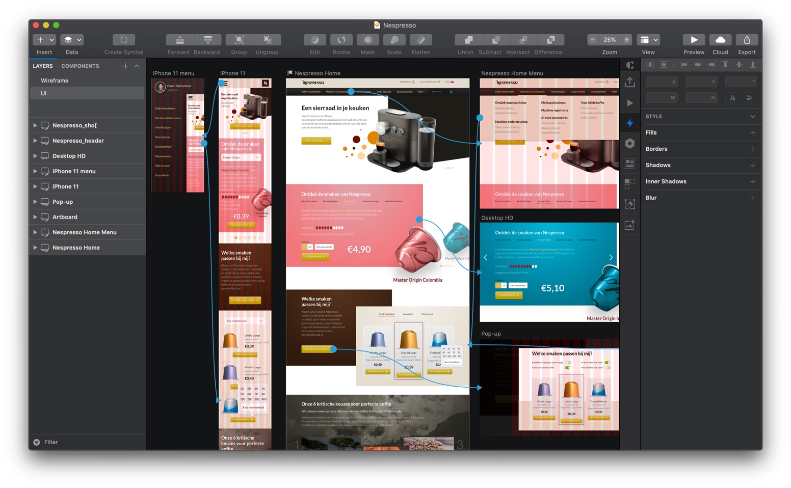
Prototype it
Allright the designs are done, now we want to make it all tangible by prototyping it. Depending on the software you use, it gives you a rough impression how it really feels like using the product. I use the Craft plug-in in Sketch, InVision or Marvell to click or swipe through a site. If the accent on (high fidelity) micro animations is more important, I use Principle for Mac.
Other users
The solution needs to be user centered, so thorough research is a must. After 3 days of intense field research, shadowing employees and interviewing them, we’ve mapped all internal proccesses and bottlenecks creating a holistic view on the matter.
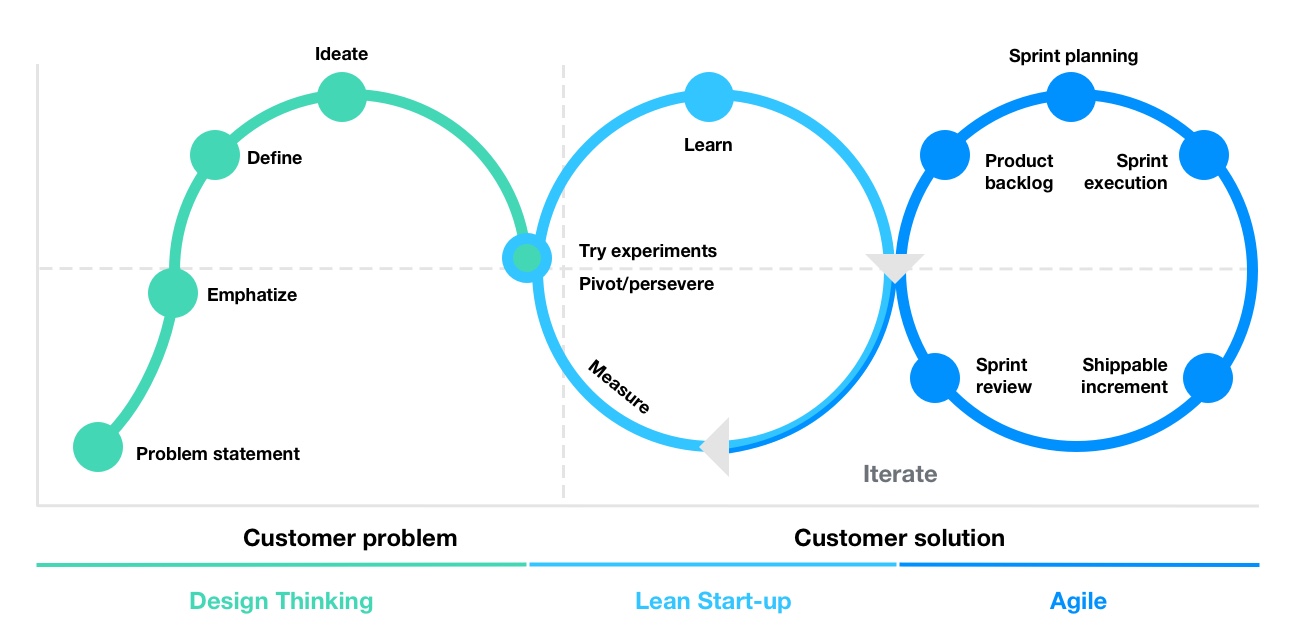
Combine Design Thinking, Lean Start-up and Agile
What you really want to do now is launch it, even if there are some slight changes. (A/B) test it, look at the data, put a Hotjar heatmap on it and analyze and pivot. That's the way to see if a functionality works and eventually make it better! This Gartner oversight is roughly my way of working. Great proposition for your company too!
Chatbot
In order to gain traction within a company working together with the client is key. So we facilitated design thinking sessions in co-creation with IKEA generating awesome out of the box ideas. We picked out two of those ideas and converted them into a proof of concept wit a strong business case.
Design thought per element
Header: carousel with dynamic content (animation/static) let's you anticipate on themes or seasons
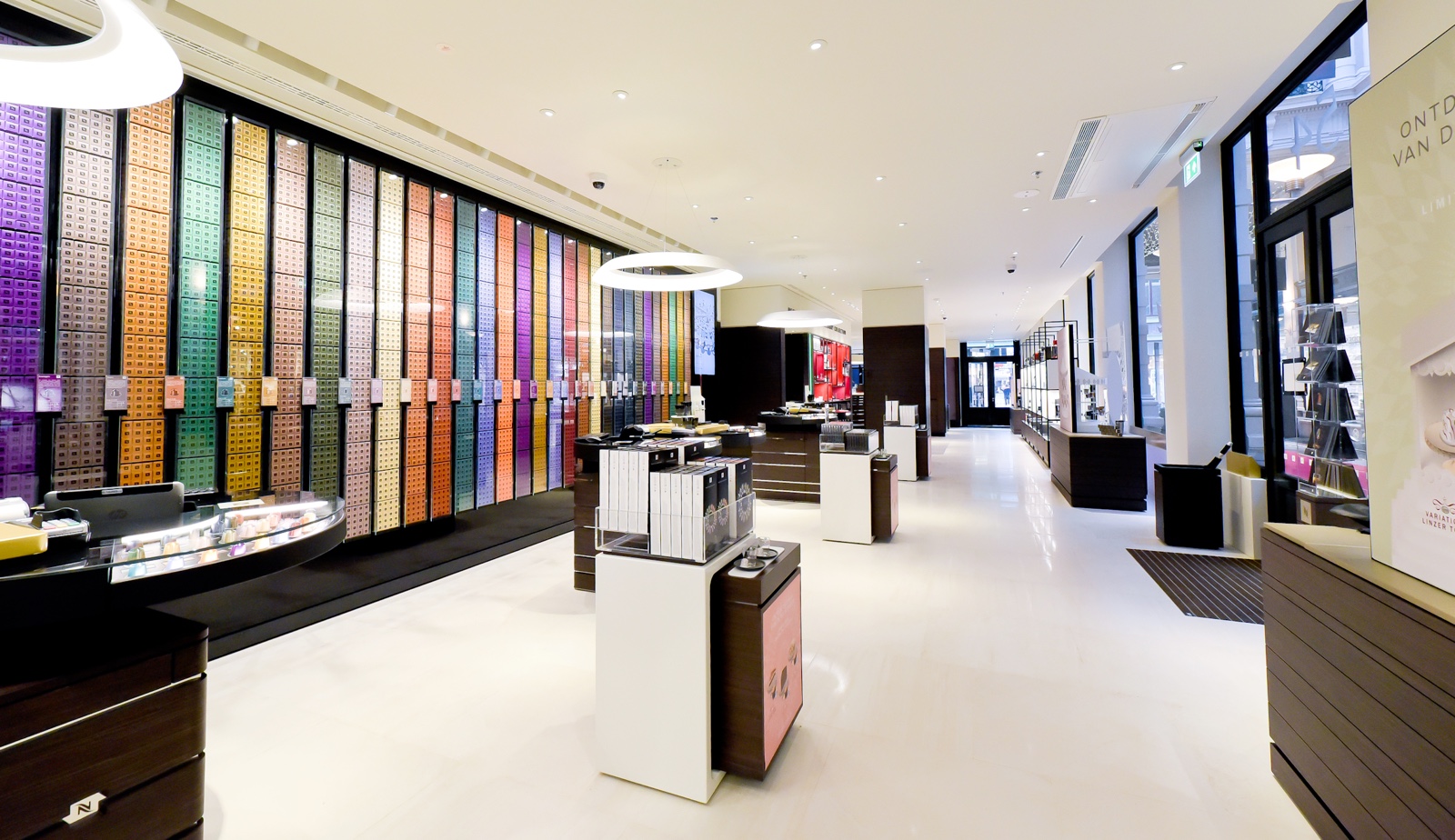
Menu bar: rearranged the current menu items making a distinction between primary and secondary content. Smooth posh color palet is extracted from the fysical store. Menu element is activated by a micro animation for orientation.
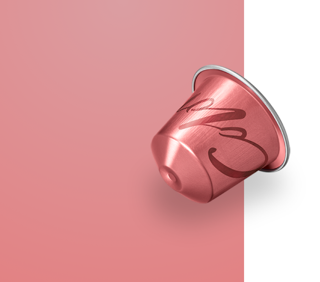
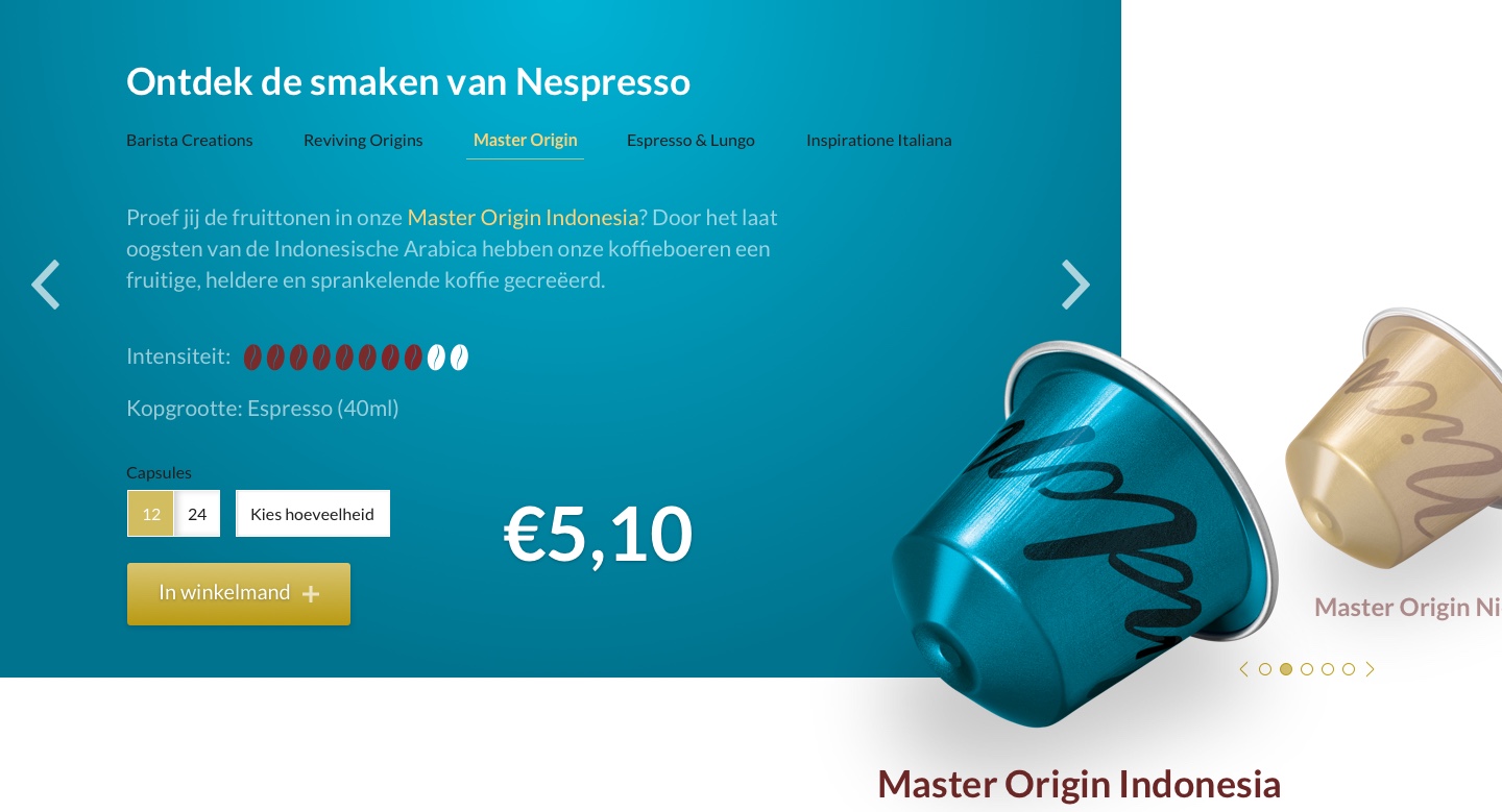
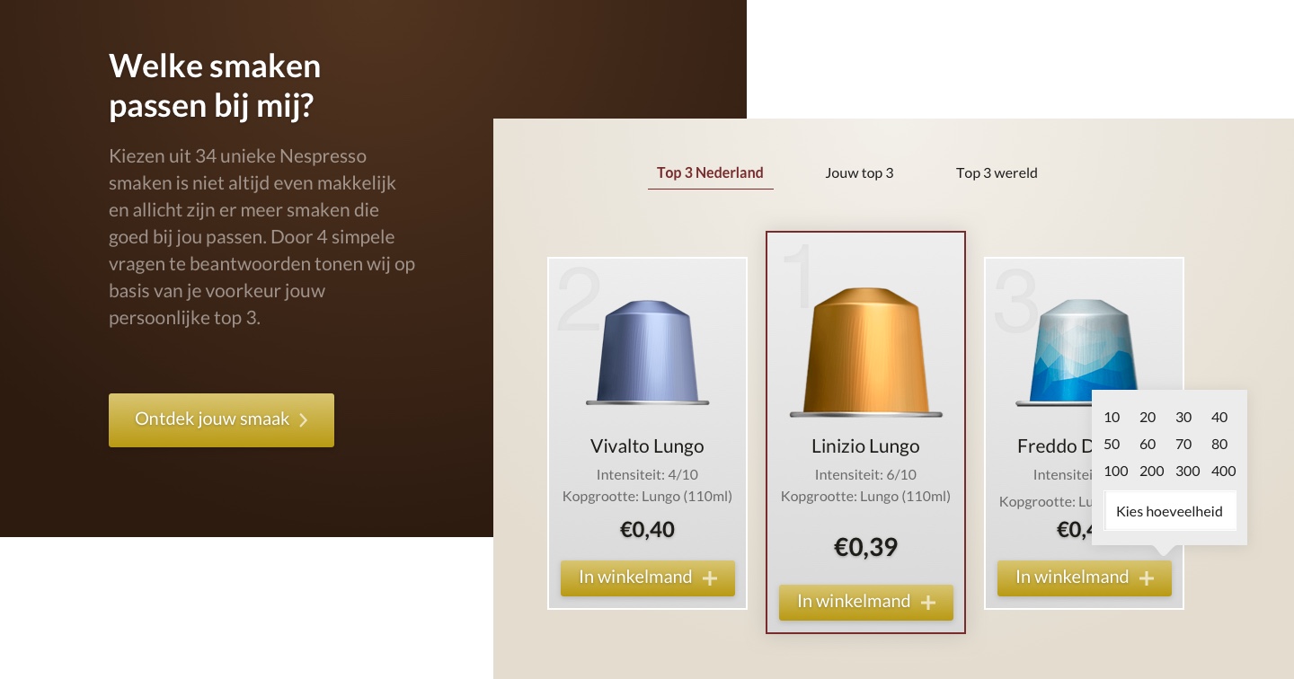
Nespresso cups: an unique selling point, but not prominent on the current homepage. All 32 cups are accessible and devided in categories. Possibility to buy and each cup has it's own unique background, a color palette you see in the stores as well.
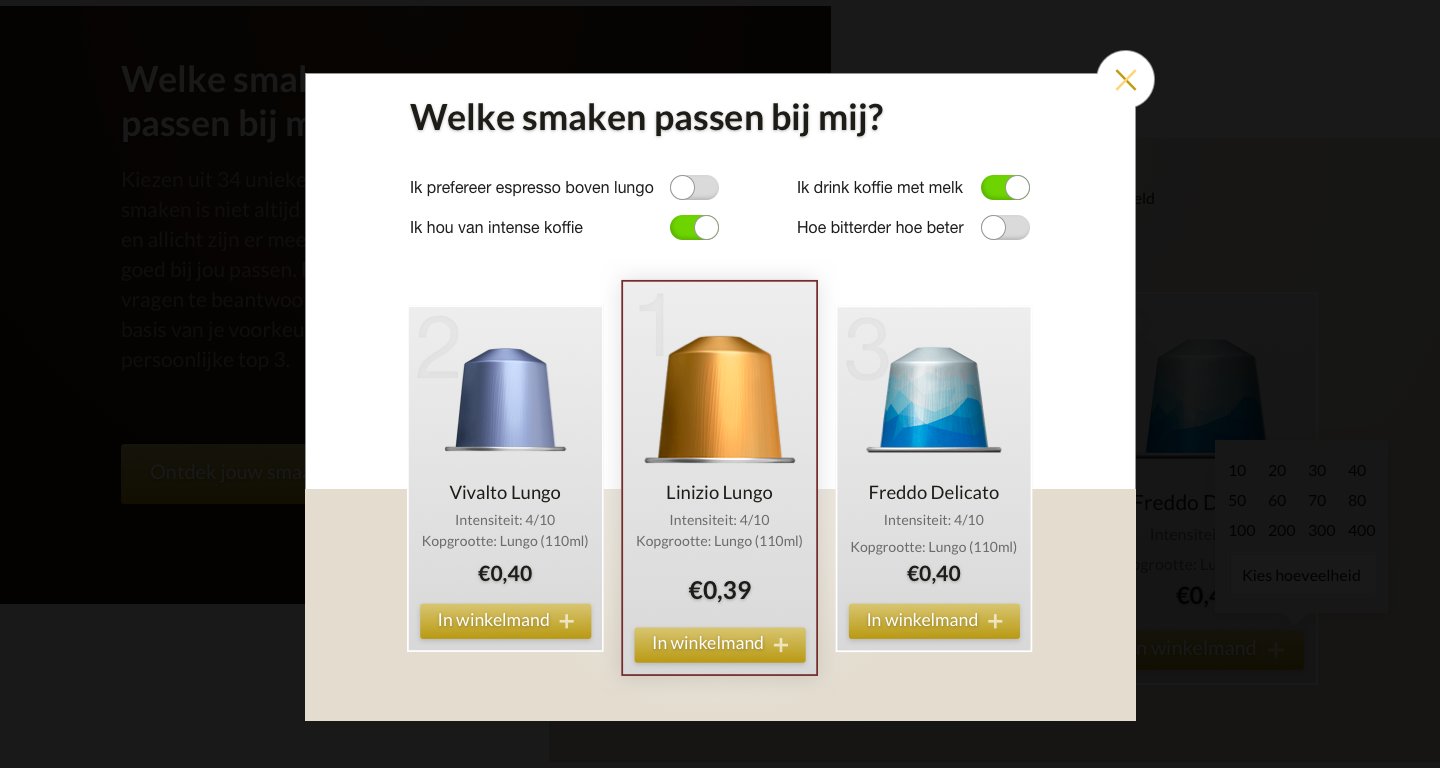
Taste configurator: I discovered that users experienced stress by the huge amount of choice in cups, so why not facilitate them by helping to choose in an easy intuitive way or offer geographical preferences of other buyers? Result will be more cross-sell and more Nespresso experience.
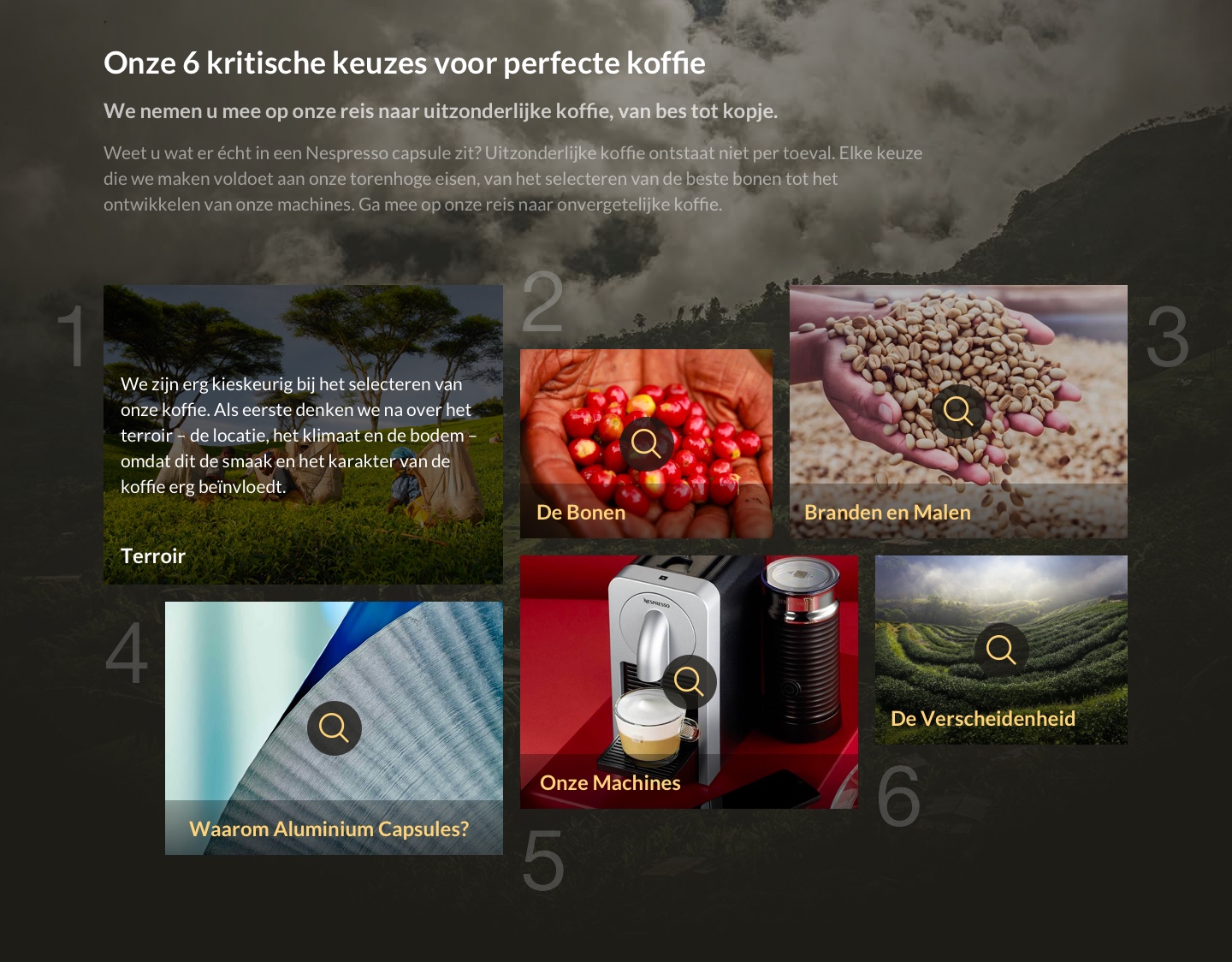
Mantra: Found out somewhere hidden on the website that Nespresso is operating under a mantra of 6 rules, from bean to coffeemachine. Awesome, communicating this to your customer will strengthen your brand identity.
Footer: color palette like menu bar, rearranged stuff and put it on grid. Easy to scan at a glance.
Curious about this desktop version? Check out the clickable demo!
Selected Works
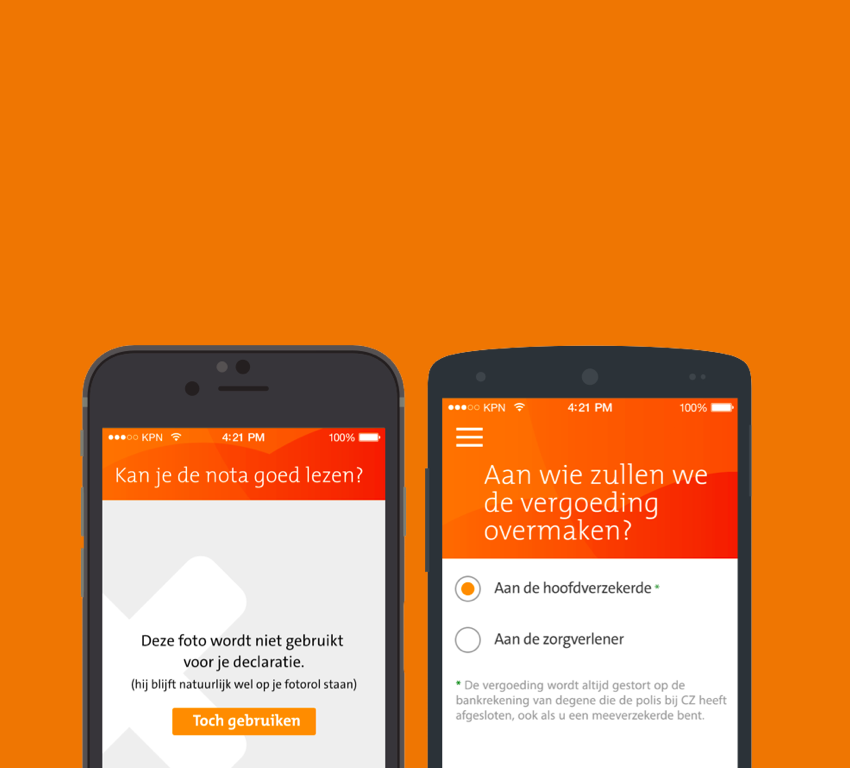
Declaratie app - CZ ZorgverzekeringenProject type
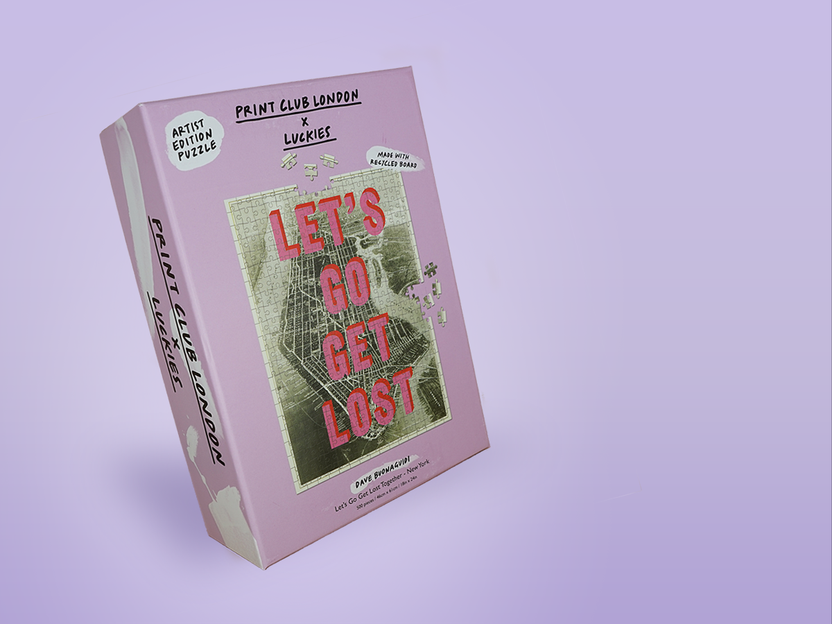
Pīntú Puzzel - WebshopWebshop
Shell - Ease the check-outService Design
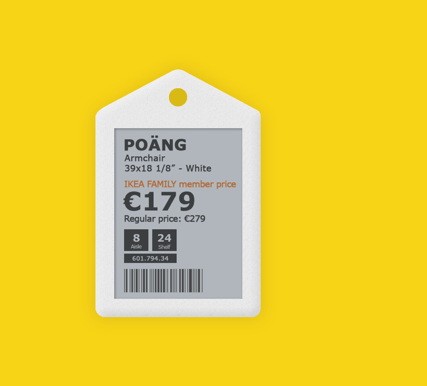
Digital Labels - IkeaProject type
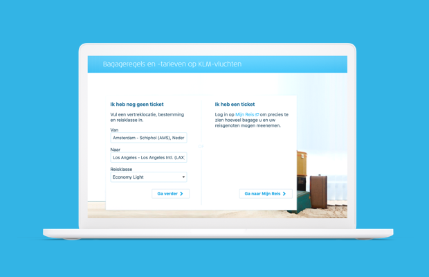
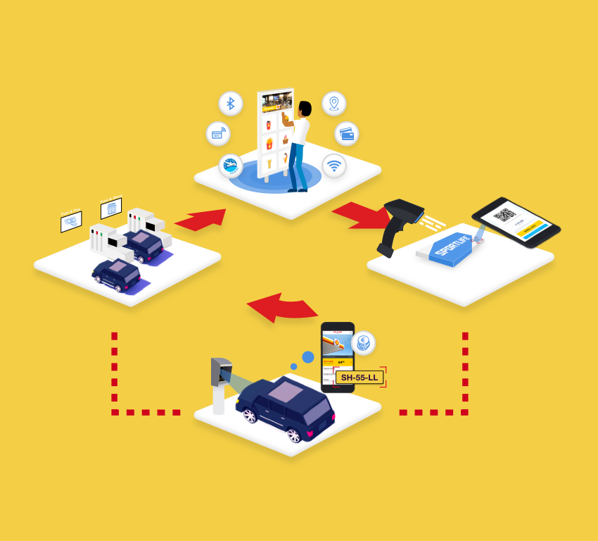
Bagage Calculator - KLM Royal Dutch AirlinesProject type
Nespresso redesign - Way of workingProject type
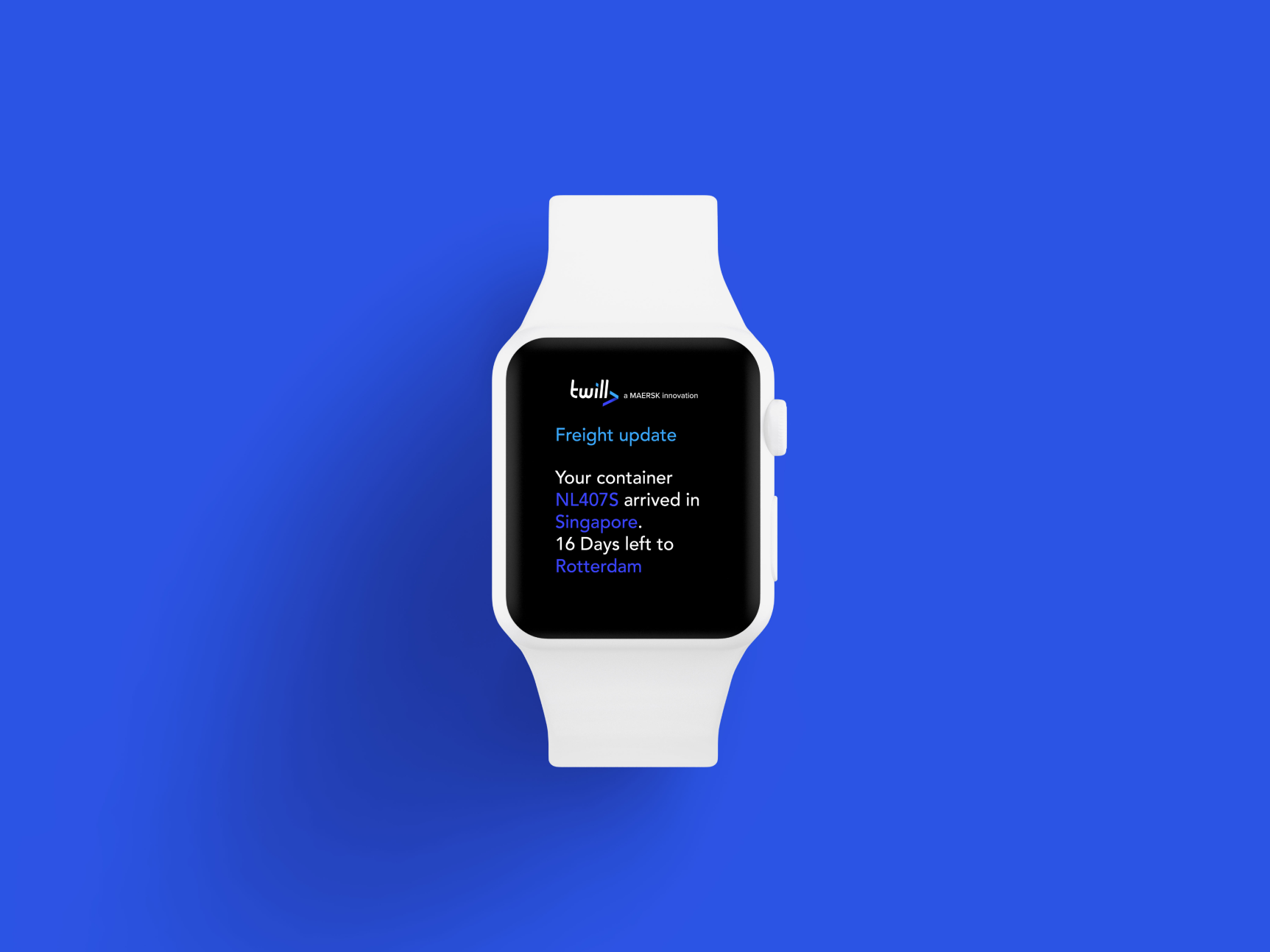
Twill redesign - TwillProject type
Code of Conduct - Akzo NobelProject type
App redesign - ExcelliorProject type